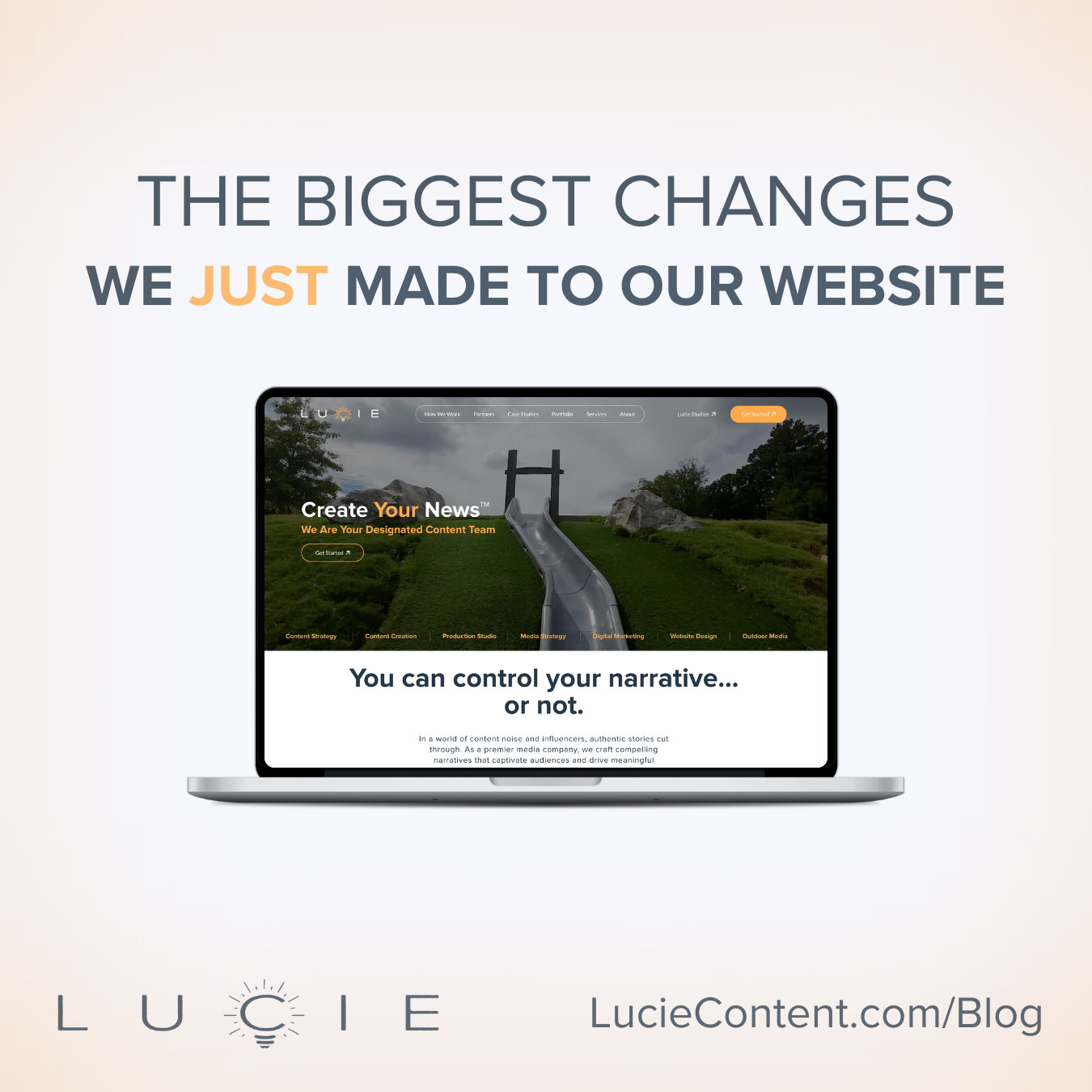
Remember when we talked about the importance of updating your website, even if you think it doesn’t need it? Well, we took our own advice. After taking a step back and looking at our website through fresh eyes (just like we suggested you do!), we realized it was time for more than just a few quick fixes—it was time for a complete transformation.
In this post, we’re pulling back the curtain to show you exactly what we changed and why. We’ll walk you through five major updates that took our website from “functional” to “fantastic,” with before-and-after comparisons that let you see the evolution for yourself. Consider this our case study in practicing what we preach.
Portfolio
Your website’s Portfolio page is where potential clients *may* decide if they want to work with you or not. (No pressure, right?) That’s why we knew our Portfolio page needed more than just a refresh – it needed a complete reimagining.
The biggest improvement? A new navigation bar at the top that lets visitors filter through our work by category. Instead of scrolling through an overwhelming number of videos across 12+ categories all at once, visitors can now click directly into the type of content they want to see – whether that’s commercials, documentaries, corporate videos, or any other category.
We didn’t remove any content – we just made it easier to find what you’re looking for. The page feels cleaner, loads faster, and shows off our work more effectively. This streamlined approach became our blueprint for the entire website redesign: keep all the important content, but present it in a way that makes more sense for today’s users.
Case Studies
The transformation of our Case Studies page represents one of our most significant website improvements. What was once a simple collection of project summaries has evolved into a comprehensive showcase of our collaborative process and creative problem-solving abilities.
Our old case studies provided the basics – a project overview and some behind-the-scenes photos. But we knew there was an opportunity to offer so much more value. So, we completely rebuilt our case studies from the ground up, focusing on three key elements:
- The Ask: What challenge did our client face, and what were they trying to achieve?
- The Strategy: How did our team approach the project, what solutions did we develop, and how did we implement them?
- The Impact: What concrete results did we deliver, and how did these align with our client’s goals?
Each case study now includes a 30-90 second highlight video that brings the project to life, letting visitors see the quality of our work firsthand. This addition was crucial – it bridges the gap between reading about our work and experiencing it.
The new format offers a deeper look into how we collaborate with clients and tackle creative challenges. Visitors can now follow the journey from initial challenge to final solution, understanding not just what we delivered, but how we got there. This transparency in our process helps potential clients envision exactly how we could help them with their own projects.
By restructuring how we present our case studies, we’ve created a more valuable resource for potential clients while better showcasing our team’s expertise and creative problem-solving abilities. It’s a change that reflects our commitment to clear communication and exceptional results.
How We Work
At Lucie Content, we provide a wide range of services, from content creation and website design to crisis communication and media training. Explaining what exactly we do and how we work with clients is challenging enough, but finding a way to display this information effectively on our website presents another hurdle. Previously, this vital information was scattered across five different pages – About, Our Team, The Lucie Difference, Services, and FAQ. Not exactly user-friendly when you’re trying to figure out if we’re the right fit for your project.
Our new How We Work page approaches this problem by answering the question head on. We’ve placed it front and center in our navigation bar because let’s face it – if you’re considering working with us, this is probably what you want to know first.
Instead of immediately asking visitors to categorize themselves into specific service boxes (Video? Social Media? Website?), we’ve created a more intuitive approach. The page opens with three interactive flip-boxes that help visitors identify their needs through simple questions. Realistically, most of our clients end up using multiple services, so why force them to pick just one?
The heart of the page is our four-step process that applies to every project we take on:
- Project Planning: Where we align on goals and map out the strategy
- Production: Where the magic starts happening
- Post Production: Where we refine and perfect
- Impact: Where we measure success and ensure we’ve hit the mark
By consolidating and streamlining this information, we’ve made it crystal clear what working with Lucie Content looks like from start to finish. No more hunting through multiple pages or wondering what comes next. Everything you need to know about partnering with us is right there, clearly laid out.
Design, Navigation, and User Experience
When overhauling our website, we didn’t just want it to look better – we wanted it to work better. That meant rethinking everything from our color scheme to our content hierarchy, creating a more intuitive and engaging experience from top to bottom.
Let’s start with the visuals. Our new design embraces bold color blocking and thoughtful use of white space to create clear visual separation between sections. We’ve established a consistent visual language throughout the site – from our rounded buttons to our standardized fonts – and introduced dynamic elements like gradient text that smoothly transitions between our company colors (navy and orange). Even small details got attention: hover over our navigation menu and you’ll notice a subtle glow effect.
But the real magic happens when you start scrolling. Elements now smoothly animate into view, our client carousel showcases our partnerships, and our navigation bar transforms from transparent to solid as you move down the page. These aren’t just fancy tricks – they’re purposeful design choices that guide visitors through our content.
Another major improvement is our new home page flow. No more random section placement and context-free content. We carefully considered the most effective way to construct our home page, and we’re pretty proud. Check out the comparison videos above.
We’ve also dramatically improved the way we present information on our site. Instead of overwhelming visitors with walls of text, we’ve refined our messaging to be more impactful with fewer words. By consolidating information and removing redundant pages, we’ve made it easier for visitors to find exactly what they’re looking for.
Every element on our new site serves a purpose, creating a more cohesive and professional experience that better reflects who we are as a company. It’s not just about looking modern – it’s about making every interaction with our website more meaningful and intuitive.
Conclusion
The digital landscape is always evolving, and so are we. Our website redesign wasn’t just about making things look prettier – it was about creating a more valuable experience for our visitors and finding the most effective way to present ourselves to the world. From our streamlined Portfolio page to our reimagined Case Studies, from our clear-cut How We Work process to our intuitive new design, every change was made with our clients in mind.
We approached this redesign the same way we approach every project: by focusing on what matters most. The result is a website that better reflects who we are, what we do, and how we can help our clients succeed. It’s faster, smarter, and more engaging – but most importantly, it’s a better tool for showing you exactly what Lucie Content can do for your business.
Ready to see how we can help you tell your story? Let’s talk.